You are not logged in.

Dear visitor, welcome to KDE-Forum.org. If this is your first visit here, please read the Help. It explains in detail how this page works. To use all features of this page, you should consider registering. Please use the registration form, to register here or read more information about the registration process. If you are already registered, please login here.

1

Sunday, December 2nd 2007, 6:22am

KDE4 - the great disappointment

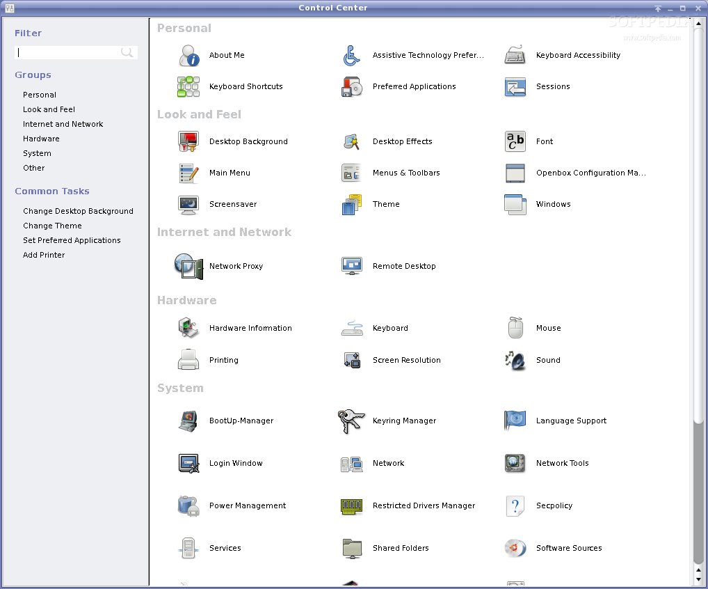
From everything I've read so far I have little doubt I will hate KDE4. In many ways it seems the developers have decided to go the way of gnome, dumbing down to satisfy those too lazy to learn. Just look at the system settings program that replaces kcontrol. This type of control panel was one of my major disappointments in the re-merge of beryl into compiz, and it's more distressing here. Why are the devs so set on losing ease of use and looking like gnome?

Another annoyance is the menu created by novell/SUSE/openSUSE. I want to know who decided this monstrosity is better? I tire quickly of constant scrolling to find what I'm looking for and if KDE4s only option is the new style menu... well... it won't be on my computers for long.

Worse yet is the influence Ubuntu seems to be exerting. KDE is another of a long line of projects that has fallen under the control of Ubuntu.

I'll give KDE4 a try when it's released but I expect to be massively disappointed and will probably start looking for something to replace it soon after.

This post has been edited 1 times, last edit by "tekwyzrd" (Dec 2nd 2007, 6:45am)

2

Sunday, December 2nd 2007, 7:28pm

I plan on being very disappointed with KDE 4.0 because it was rushed; though, KDE 4.1 should get everything back on track.

I don't understand how KDE is going more like Gnome? Could we explain, I know KDE is going more simpler. Is that a bad thing?

Also, I and many other belive that the Release candidates should have been betas and the betas should have been alphas.

3

Monday, December 3rd 2007, 6:46pm

I don't understand how KDE4 could be considered rushed. I started reading that it was in the planning stages over 2 years ago. As I see it, they took too long talking about it and set a deadline they had no possibility of meeting. This forced sacrifices compromises in functionality. Others were demanded by one particular over-rated distribution that seems to be exerting influence over a wide variety of projects.

Making things simpler is a bad thing because it encourages laziness, complacency, and ignorance. Why bother learning when you can convince devs to dumb it down? This always brings to mind training and testing in the US Army. There aren't enough graduates for a technical job? Make the tests easier. I find the idea of medical equipment techs, weapon system techs, etc. with a sixth grade reading comprehension level very troubling. Similarly I find it disturbing that the Linux community seems to be bowing to the uneducated rather than educating them. Making things simple by removing options only hurts those who are willing to learn, the users who have come to appreciate the complexities and options.

Why do I say kde looks like gnome, or ubuntu is exerting influence?

Look at

and the origin of planned replacement for kcontrol


Based on my experience with the CompizConfig Settings Manager, the constant icon click and back button clicking is tiresome and definitely NOT an improvement over the Beryl Settings Manager. Similarly, System Settings is not an improvement over kcontrol.

This post has been edited 2 times, last edit by "tekwyzrd" (Dec 3rd 2007, 6:57pm)


alecs1

Trainee

Posts: 53

Location: Romania

  • Send private message

4

Thursday, December 6th 2007, 11:59am

I am too one of the ones that hates the new KDE menu and the new systemsettings.

But I sure hope there will be someone to listen to the users, as KDE developers have been on the right track until now.

Unfortunately the bugzilla is hopelessly big, and there it seems there are not enough people to adress it.

But don't hate KDE 4. Write code if you can, bug the developers to death, anything else.
Enjoy

alecs1

Trainee

Posts: 53

Location: Romania

  • Send private message

5

Thursday, December 6th 2007, 10:16pm

http://bugs.kde.org/show_bug.cgi?id=153556

This is the wish about systemsettings that I opened at the kde bugzilla. Please vote for it.

If someone opens a bug for the KDE Menu, please post it here so we can vote.

Alex
Enjoy

6

Wednesday, December 12th 2007, 5:44pm

I have the latest "KDE Four Live" built by openSUSE which includes KDE4 RC2 running on one of my computers and it seems I have underestimated the degree of disappointment users can expect. Among my initial observations are:

Desktop: No refresh in context menu, No desktop icons, Only option in "Configure desktop" is wallpaper selection, New widgets created behind widget selector, closing newly created widget kills desktop resulting in an all white display.

Menu: Stuck with the poorly designed menu

Taskbar and system tray: no configuration options. What you see is what you get.

Other: Poorly designed gnome clone system settings app

In all, KDE4 is a far greater disappointment than I expected and is nowhere near ready to be considered a "release candidate". To be honest it should still be labeled as an "alpha" build. It is nowhere near ready for release and to do so will only push people toward gnome and other desktops. I started reading about the great plans and work being done in preparation for KDE4 in 2005 and have to wonder "After two years of work is this the best they could do?"

Maybe things will improve with v4.1 when it's released (2009?) but for now, don't waste your time with KDE 4.0.

This post has been edited 1 times, last edit by "tekwyzrd" (Dec 12th 2007, 5:46pm)


7

Thursday, December 13th 2007, 3:45pm

I have also tested the two RC candidates (kubuntu live CDs). It certainly feels kind of rushed for it to be a RC. My biggest pains after testing the last one:

* The customization thing in the top-right corner. It's always there nagging you and the way to remove it is not obvious (which I would consider an option when right-clicked). How many users are likely to profit from the zooming options in there?

* The KDE button in the kicker replacement: it has been slightly moved to the right, so it no longer is pressed when the mouse is at bottom-left. There was an excellent rant by Joel on Software about the four privileged points in the desktop: the corners. Any button in a corner has infinite size in two directions, so you can just throw the mouse and never miss it. The KDE button should take advantage of this (or at least not relinquish this advantage just for aesthetical purposes).

* The systemsettings. Not only you lose the global view of it all when you're inside an option, but the division between General and Advanced adds additional burden by artificially hiding things. At least have it all together.

I think I could bear the radical change in appearance if it weren't coupled with backsteps in functionality.

susegebr

Beginner

Posts: 55

Location: Willemstad Curacao

Occupation: Pensionado

  • Send private message

8

Friday, December 14th 2007, 8:13pm

KDE 4 or KDE alpha 0

As a Suse user back from Suse professional 6.0 i have had no objections to a singe piece of the distro.

With Opensuse 10.2 an 10.3 you have the Windows Vista look a like menu
You can swith it back to the normal KDE menu. And now KDE 4 !!!!!!! HORROR

If the versions to come Opensuse or Suse GMBH with only KDE4 as it is or what ever version I can better swith to Vista or BSD or even OS/2 or stay with opensuse 10.3 and
KDE version: 3.5.8 "release 22.3".

The developers are over the top, there seem to be no specs of what has to be or what wont be in Kde4. There seems to be no coordination. See the bug reports
You cant switch the menu to the normale kde 5.3 layout.
Ditch Plasma and replace it with Kde3.5.8 screen + kicker + menu + Qt 4
and leave the rest to Compiz-fusion with far more options.
Then the Weatherapplet will work again with icons and not a window with text, what the NOOA site can do far more better.

Botomline never fix what aint broken

So go for KDE 3.5.9 + QT4

alecs1

Trainee

Posts: 53

Location: Romania

  • Send private message

9

Saturday, December 15th 2007, 12:29am

Hold your horses, it's not as bad as it could be :).

1) Indeed, someone played a naming trick here, to make more users look at the new KDE version. What I don't understand, is why the *** did people want more testing if they don't want to hear opinions ?(.

2)Just to see that this is not as bad as it could be, think that someone just wrote a poll to ask if they should just close all bugs. ROFLMAO. Unleash the bug testers, and then just tell them they did all the work in vain.
Of course the poor guy deleted the poll and erased lots of angry messages (including mine :P), asking such a thing when people are unhappy is like going to the biggest and baddest man you can find and tell him he is ugly.
Here is the link, it must have been one of the most visited pages these days:
http://www.bramschoenmakers.nl/node/299
I think this guy is bram85, who used to help a lot on this forum.

3)Thank you for voting the systemsettings bug, please post the most bugging ones here so we can vote (a parallel bugzilla).

4)If you followed me until here, here is the bad news: this forum is not as important as I liked to believe. There are not many developers, core KDE community here. They use the mailing list.
Enjoy

10

Saturday, December 15th 2007, 2:41am

Re: comment by susegebr

Quoted

Ditch Plasma and replace it with Kde3.5.8 screen + kicker + menu + Qt 4
and leave the rest to Compiz-fusion with far more options.


This would be great except for the fact that compiz-fusion is gnome oriented with kde reduced to an afterthought. Just look at the compiz configuration app. It's another poorly designed control panel similar to the images I linked in a previous message. Another constant series of icon and back button clicks.

When Beryl was a separate project great advances were being made in KDE Beryl functionality. Then they bowed to the demands of ubuntu, merged with compiz and... poof... KDE support all but disappeared.

It's too bad Beryl wasn't adopted as a part of KDE. It would have led to one heck of a desktop.

This post has been edited 3 times, last edit by "tekwyzrd" (Dec 15th 2007, 2:46am)


toad

Trainee

Posts: 66

Location: capital of beer

  • Send private message

11

Monday, December 17th 2007, 12:49pm

just a quick reply - the new kde system settings is directly copied from the horrible MAC OSX, not gnome (which IMO is far superior to the OSX clicking madness).

Kubuntu has taken to this but kcontrol is still there - will it disappear in KDE4??? Please say no...
running on Debian Etch

12

Monday, December 17th 2007, 3:21pm

RE: KDE4 - the great disappointment

in my opinion KDE4 is look as alfa version.
I' download new kubuntu life with kde4 beta 2 and I'm not able to do anything. No menu, no icon, nothing. I;m very disapointed of new KDE4

13

Tuesday, December 18th 2007, 10:30pm

Uh oh.

I am a 9 year Debian user, who got sick of spending hours manually configuring things so switched to OS X
five months ago. Now I find I can't do anything substantive because on the Mac everything is so
simplefied, simplefied, simplefied. Seems to be the overriding philosophy. And I am shocked to find that
OS X is not object-oriented.

So I am thinking about installing Debian on my MBP, and was wondering how KDE4 is coming along? Hm.

This post has been edited 1 times, last edit by "Quantum" (Dec 18th 2007, 10:31pm)


alecs1

Trainee

Posts: 53

Location: Romania

  • Send private message

14

Tuesday, December 18th 2007, 11:23pm

The answer to your question:
KDE 4 is nowhere near release candidate. That is just a name to atract testers. KDE 4 has finished products (Kate) and alpha quality parts, the plasma desktop.

As a side question, were forced to configure manually in Debian? I do that many times, but only because I break things out of curiosity, and I have to fix them, I think that if I just use it as a normal user the thing would simply work. I don't remember having problems because of debian, but because I created them.
What does object oriented mean in the context?
Enjoy

15

Tuesday, December 18th 2007, 11:41pm

Well for example I deeply configure my system to look just like I want it. This means tinkering in its guts
more often than not, but after doing this for many years I have about got that down.

But in installing apps, oftentimes things do not work. For example tightvnc will simply not start on boot,
no matter what I do. (rc script) I must start it manually each time. And when I must set up a reverse-SSH
tunnel anew I must always go back to my notes. (part of this is I am getting older) Cups just broke, in some
deep mystical way, and I am unable to fix it so am now forced to reinstall Debian from scratch. And
setting up something like Asterisk or the ATI remote control simply have proven to be beyond my capabilities.

By object-oriented, I mean like Linux: everything is an object and can be manipulated as such.
Humans evolved to deal with objects, not text or math. Right-click gives full control over all apects of that object.
Object-oriented is the most advanced human interface devised to date, but the major OS's seem to be
getting away from it. No, this does not mean it's inferior. Long story. For the whole sad story check out on
Wikipedia, Taligent, and object oriented.

This post has been edited 2 times, last edit by "Quantum" (Dec 18th 2007, 11:44pm)


16

Saturday, January 5th 2008, 10:10am

What a lovely load of negativity here ;-)

First of all, something which will probably make a lot of you happy: the new menu will indeed be default, but the old menu will be there as an option.

Second, indeed, the basic desktop is the most unfinished part of KDE if you compare it to KDE 3.5.x menu & kicker. Less configurability, but far superior in terms of code - the old crap was simply impossible to maintain. And really Aaron knows what he is talking about when he said that - he has been maintaining kicker for years.

About the whole menu thing, Kubuntu had systemsettings before Ubuntu developed their thing, so if anything was stolen between KDE & Gnome, it's Gnome which copied from KDE. Personally, I prefer the Gnome settings thing - except for the fact it annoyingly opens separate windows instead of keeping it all in one window.

I would indeed love to keep the sidebar there, so you have an easier time going back and opening another window - having a treeview like in KControl would rock even more. The good news is that the developers want to have a KControl-like treeview in systemsettings, the bad news is that they simply didn't get to implementing it.

So, if so much is not ready, why do a release, some of you might wonder? That's because KDE is a big project, and many parts of KDE simply ARE ready for a release. If you take the games and Edu applications, but also most of KDE Graphics like Okular; and things like Kate & KWrite - those apps are ready. Have been, sometimes for almost a year already (!!). And FOSS project needs to release, and not releasing those apps did and does hurt them. So, even though not all of KDE is fully ready for a release, we had to bring it out to get those which ARE ready in the hands of the users so they can gather feedback and new contributors.

The issues with the other KDE parts, not ready yet, can be fixed in KDE 4.1 - after all, it is possible to run KDE 3.5.x apps in KDE 4.0, and to run KDE 4.0 apps in KDE 3.5 (latest OpenSuse already comes with KDE 4.0 apps).
-=| life sucks deeply |=-

susegebr

Beginner

Posts: 55

Location: Willemstad Curacao

Occupation: Pensionado

  • Send private message

17

Monday, January 7th 2008, 4:58pm

Sure kde3 programs run on kde4 and visa versa only ksysguard not
if you switch from kde3 to 4 use ksysguard and then back to kde3 ksysguard is giving errors not connection to local host .
reload kde3 ksysgard and all is well again.

so ihave 2 rpm's ksysguard kde3 and kde4 to install if i switch between kde3 and kde4

Is there an other way with less hassle ???

18

Wednesday, January 9th 2008, 4:55am

I cant agree more

KDE dev team you guys are the best. I can see that the loss of user and distro is a big letdown, but KDE 3.5 is a much better desktop the gnome. Don't fallow the masses just because the are simple users. The will catch on and love it.

19

Saturday, January 12th 2008, 9:55am

Agree

It's been a disappointment, I thought that KDE4 would increase productivity, but I was wrong.
My first steps after installing KDE4 were to personalize the panels. In 3.5, I have two panels, one on the top with the menu and the applets, and one on the bottom, with the task manager and, an icon to show the desktop and the virtual desktops. I've been many years working with this configuration, and in kde4 I can do none of those things. I can't believe that it's impossible to move the panel, to add some applets, to add the button to show the desktop, change the size of the panels... Maybe I haven't seen it yet, but if I can do this, I won't use kde4 anymore until I can do it.
Kde4 still has a long long way to go before it gets really usable.

regx

Beginner

Posts: 3

Location: Olympia, Wa

Occupation: software developer

  • Send private message

20

Saturday, January 12th 2008, 7:18pm

RE: comment by susegebr

"It's too bad Beryl wasn't adopted as a part of KDE. It would have led to one heck of a desktop."

amen!
I Haven't lost my mind, it is backed up on tape somewhere.

This post has been edited 1 times, last edit by "regx" (Jan 12th 2008, 7:20pm)